What you need to know
- Fitbit is refreshing the Health Metrics page on mobile to feature a new look that matches the rest of the app.
- The Health Metrics UI is also changing, ditching the “Today” and “Trends” views.
- There’s now a focus on the individual health metrics, and you can find more detailed data by tapping a specific metric.
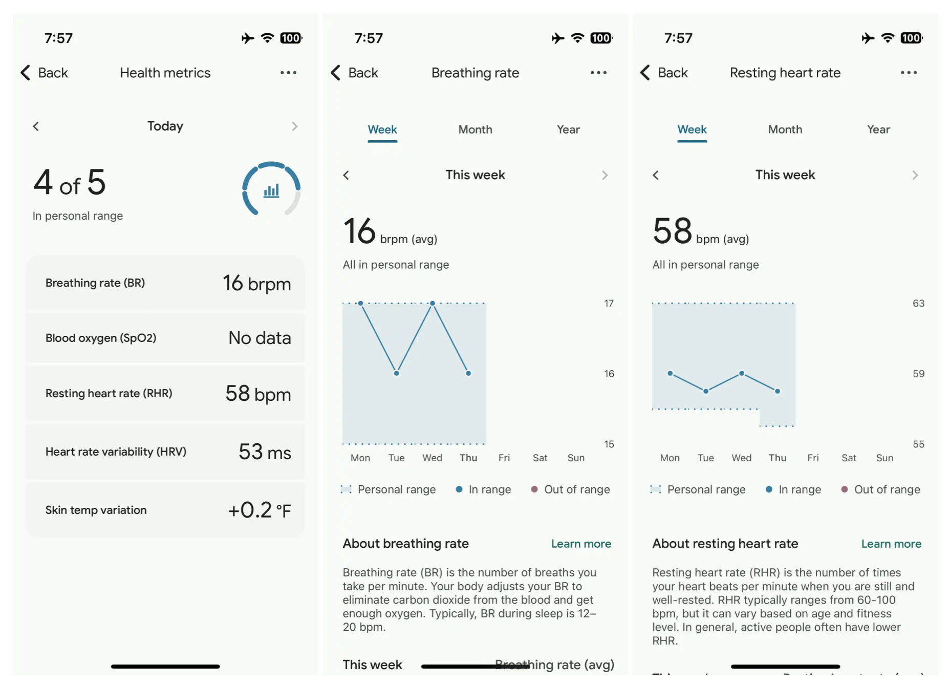
The Fitbit app on Android and iOS has a Health Metrics page for data points like breathing rate, resting heart rate, blood oxygen, heart rate variability, and skin temperature variation. While the Health Metrics page used to be a basic user-interface that didn’t match the bulk of the Fitbit app, that’s changing in an update. Aside from getting a new look, the Health Metrics UI is tweaked to make it easier to view your data, as first spotted by 9to5Google.
While the preview card on the main Fitbit app homepage isn’t new, tapping it brings you to a fresh Health Metrics page. Here, you’ll see a list of the five health metrics recorded, and a quick gauge of how many of those metrics are in your “personal range.” In a new change, only the “Today” stats are shown on the main Health Metrics page.
To see longer-term data, you’ll need to tap a specific metric individually. This will bring up a detailed view with graphs and data spanning the past week, month, and year intervals. This page also explains each data point and its significance, with a Learn more tab for users to get more information.

Previously, you could see this data by switching to the “Trends” tab in Health Metrics. Instead of the “Today” and “Trends” tab structure, there’s now a new focus on sorting data and views by the metrics themselves.


